In order to verify that content will look good on all screen sizes, it is important to view your content in a few different way to assure it looks good on a phone, tablet or computer. The most common way to view content on different screen sizes is using the developer console in Chrome or Edge.
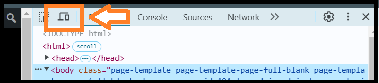
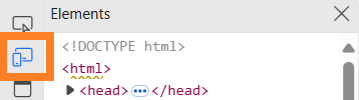
In either a Chrome or Edge browser, press the F12 button, this will open the developer console. Next click the little icon that looks like a big screen and a phone next to each other, shown below.
Chrome:
Edge:
This will show the page in a way where you can change the device being used at the top where it says “Dimensions”.
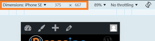
Click the drop down arow by the current device to see a drop down of available devices.
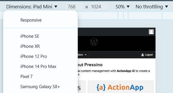
Be sure to check a phone size and a tablet size, may also try responsive and move the size around and see what looks odd.
Note: If it looks funny when you change the size, refresh the browser. Sometimes in preview mode it doesn’t update the same way as it will when initially loaded.